
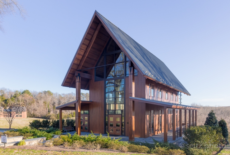
As I work through some older shoots for blogging, I am happy to return to this chapel that I photographed in early 2017. It’s a building that I would love to return to, and one that I wished I had more time with when I was there. I remember everything going wrong on this shoot: my tripod was breaking, I didn’t have the right plate and had to rig something up to half work, and I was on an extremely tight schedule, trying to get to class on time! I ended up being late, and it was definitely worth it to spend as much time with this building as possible.
What I want to talk about today can be summarized in two main points:
- Photographing the exterior looking in
- Photographing the interior looking out
Architecture itself is the creation of new functional space within a landscape, so it follows that architectural photography can be best summarized as a two dimensional representation of this new three dimensional space. In this post, I hope to help you get a sense of my methodology for expressing these relationships- inside out, and outside in.
Photographing the exterior looking in
Oftentimes, it is important to nail the exterior shot. The exterior of a building is people’s first and sometimes only relationship with it, and because of this it is usually the most striking and iconic view of a building. While an interior shot may be beautiful or represent a building well, your viewer is much more likely to say “Oh, that’s (so and so) building!” by looking at a shot of the exterior.
However, what is an exterior shot? Here are several ways of describing an exterior shot, trying to stretch the definition a bit:
- It is a photograph taken from the vantage point of anywhere outside of the building’s envelope.
- It is a photograph that displays the total or partial volume of the building, and how that fits into the broader space around it. (Think of a photograph of a small building being dwarfed by skyscrapers that have been built around it, and how this photo is interesting because of the disparity in volumes).
- It is on the outside looking at the building.
- It is on the outside looking into the building.
Think about the difference in these last two. Compare the overall effects of the two following images.
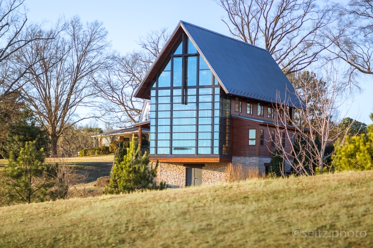
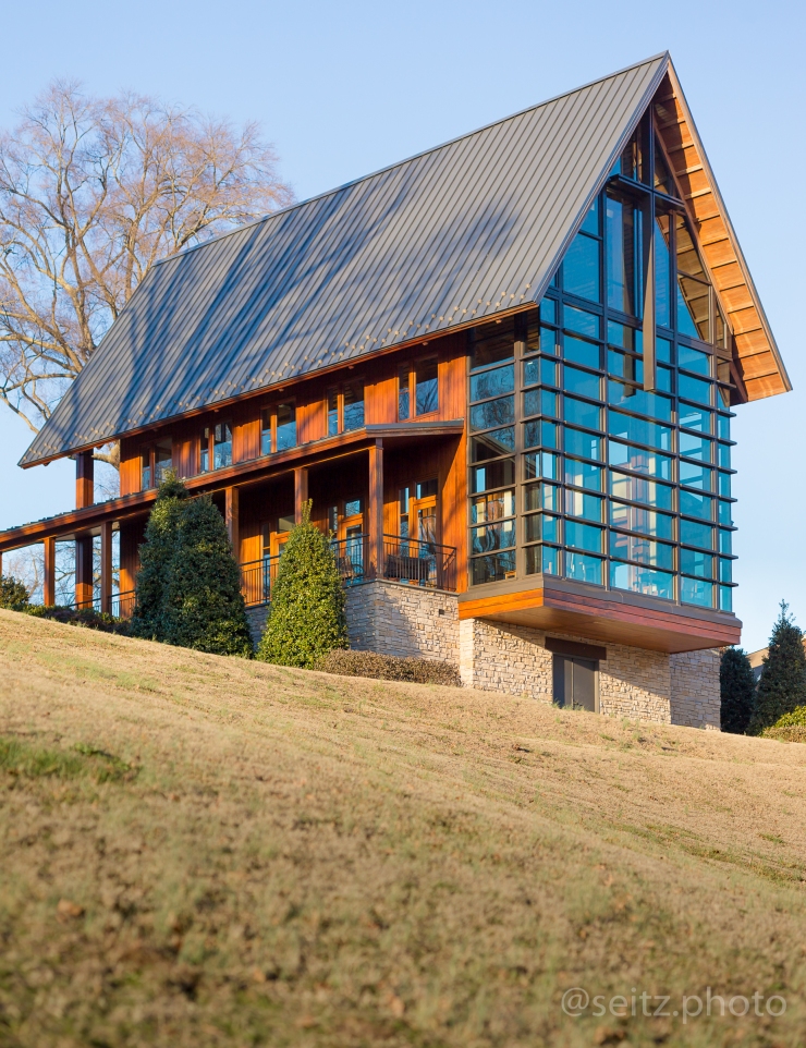
When I photograph buildings, I try to think about how the outside relates to the inside. Some of the best architecture can disorient your spatial perceptions and play to the perception of the viewer at the ground / eye level. Think about the last large piece of architecture you walked into, and what the experience was entering the front doors after getting a sense of the space from the outside.
For an extreme example of disorientation that can occur, refer to the following picture of One World Trade Center, photographed from alongside one of its street level exterior faces.
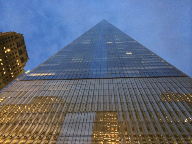
Do you see how the tower looks infinitely tall when photographed from that perspective? The first thing I often do when photographing exteriors is try to move around the entire building to try to get a sense of what the building is “doing”. That is, how the volume appears from a variety of angles. I will try to move up and down as much as the surroundings allow, and definitely try to move completely around the outside of the building.
The size, shape, materials, and total space of the building is constant, but shifting light and shifting vantage points will always make it appear different. So pay careful attention to how the building is represented under changing conditions.
Takeaway: When photographing exteriors, move around the building and pay attention to what different vantage points communicate to try to give a sense of the interior volume and overall effect of the building within its environment.
Photographing the interior looking out
Let’s break down some other ways of think about interior spaces, as we did with exteriors:
- Any image photographed within the building’s envelope, which itself sits within a broader space.
- Any image which demonstrates the internal functions the building was created for. (A building is usually functional on the outside, but it is of course primarily meant to be used on the inside.)
- On the inside of the building looking out.
As with many sacred spaces, this chapel was designed with the intent of drawing the occupant upwards. This is why cathedrals have steep and vaulted roofs, pushing the eye upwards and drawing the essence of an individual up towards the lofts of the ceiling and all that is above it.
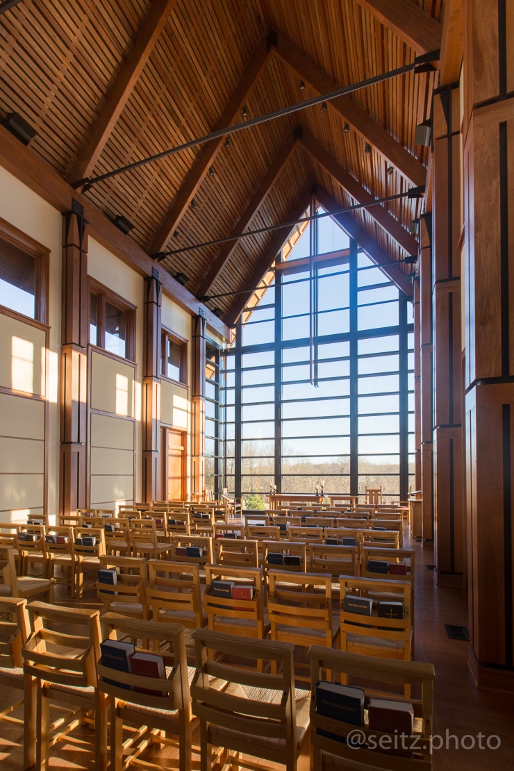
It is often easy to show this relationship with a simple off-axis view of the interior of the space, but pay attention to keeping vertical straight! It goes as a given to anyone who has spent any time photographing architecture, but a sure way to destroy any semblance of this effect is to not straighten out normally converging vertical lines using photoshop or Lightroom. Or, if you’re lucky enough to own one, using a perspective control or “tilt-shift” lens.
Compare the two images below, otherwise identical:


Notice how the second image is “falling away”? It is important to correct for this effect, which is a result of leaning the camera back to photograph something above the horizon without a perspective control lens.
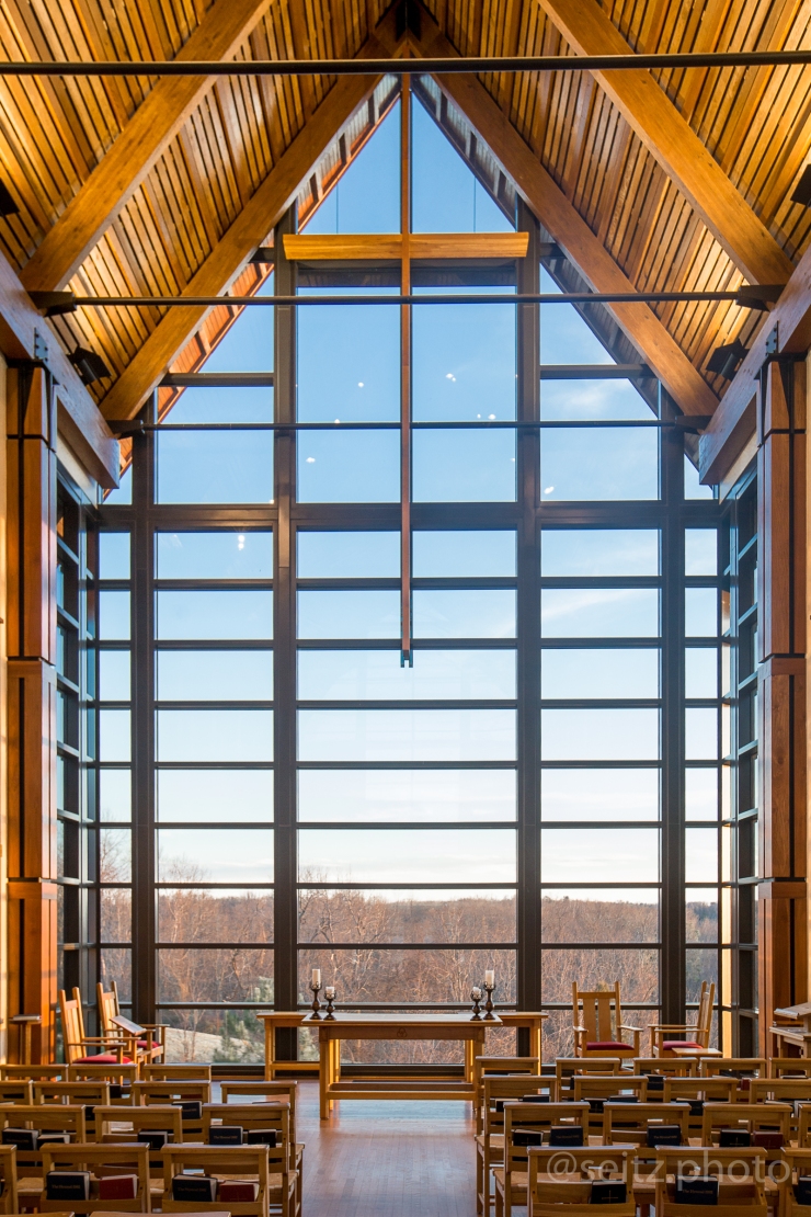
Think back to the previous blog post and the discussion of details and main features. For this building, the main feature of the space was absolutely the cross and altar below it. However, another main component of the building was the panoramic view of the trees and hills past the front of the chapel. By photographing the interior with a sensitivity to how it fits into the outside world, you can create more depth in your images.
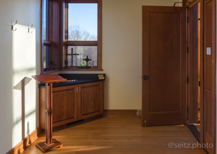
Even a simple space like this side room can be made more interesting through an arrangement like the one photographed above. By placing the lectern in the light coming from the open door, as well as having detail in the window nearby, the space is instantly related to the exterior, and the “airiness” or overall amount of natural light in the space is further elaborated.
While a photo like this may seem redundant to the first photo in this section, this is the best image I made while in the space detailing the feeling of floating and projecting into open countryside when standing at the head of this chapel. The light streaming in creates an interesting asymmetry in the image, as well as giving some mood to the image. The light streaming across the trees and space outside comes into the space, just as the majority of this image is comprised not of the interior fixtures, but the exterior space. This chapel was primarily made of glass and wood, which instantly relates it to the exterior: open air and trees. So, with the great windows at the front and rear of the chapel, it was important to try to communicate this open and airy design.
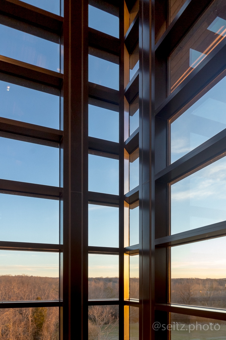
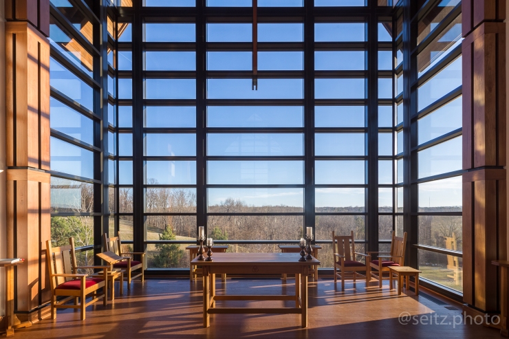
This image hones in even further on the relationship between inside and outside. This focuses on the pattern of the windows at the corner of the chapel, and includes no information about the floor or ceiling of the chapel itself. It is almost entirely comprised of the surrounding landscape, from which we get the ground, horizon, and sky, and the building is, in essence, superimposed on the surrounding space. Using this image in context of the rest of the shoot can give a great sense of where the building sits in relationship to its surrounding space.
When photographing like this (trying to show both inside and outside), it is of the utmost importance to balance the exposure of the interior and the exterior. Lightroom has gotten good at recovering detail from shadows very near black and highlights very near white, but at the end of the day, nothing beats artificial lighting if used correctly. But I’ll have more info on that in later posts.
takeaway: communicate the total interior space using overall shots with straight vertical lines, and then find ways of showing the relationship between the outside space and light and the interior space.
Thank you for your time! Next week, I’ll be traveling in Georgia, so I think I’m going to revisit my photos from the same trip last year, and take a Christmas break from architecture for a week 🙂
If you want to keep up with new images as I post them, check out my instagram, @seitz.photo.

Leave a comment